Logo Design for an Interior Designer
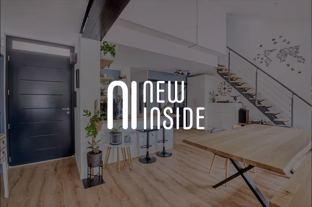
New Inside is an interior design company based in Toulouse, France. At launch, they had no visual identity at all: no logo, no graphic guidelines, nothing to present themselves professionally to their first clients. The mission was to create a logo capable of standing as a complete brand mark, recognizable across every touchpoint: from favicon to large-format print, client documents, and social media.
The Brief: Finding the Balance Between Freshness and Timelessness
The name "New Inside" already carries a strong promise: the transformation of interior spaces. The logo had to embody this idea without falling into the sector's visual clichés, which too often rely on house icons or furniture silhouettes. The challenge was to create something distinctive and recognizable across every touchpoint: business card, quote document, Instagram profile, and physical signage.
Three creative directions were proposed to explore different interpretations of the brand positioning: a clean typographic-only direction, a direction built around a custom monogram, and a combined version with tagline. Each option had its own visual logic and brand territory.
The Creative Process
The core of the project was the design of a custom NI monogram, where the right leg of the N merges with the I to form a single, compact geometric symbol. This is not a simple two-letter combination: it is a new shape in its own right, one that works equally well at very small sizes as an app icon and at large format.
The "NEW INSIDE" wordmark was set in a condensed all-caps sans-serif, reinforcing the brand's solidity and contemporary feel. The combination creates a balance between an expressive symbol and clean, restrained typography.
Four variants were delivered to cover all use cases: the primary logo with monogram and wordmark, the version with the tagline "Confiez-nous votre intérieur" for institutional materials, and the standalone icon in both light and dark versions with rounded corners, ready to use as an avatar, favicon, or app icon.
Color Palette & Typography
The palette was built around two complementary tones: a warm, elegant off-white beige as the primary color, and black as the accent. This positions New Inside in the premium segment while remaining timeless. The condensed sans-serif typography reinforces the brand's modernity while ensuring perfect legibility across all media, digital and print alike.
Deliverables
The logo was delivered in multiple versions: primary version, version with tagline, standalone icon in light and dark versions with rounded corners, and favicon. All files were provided in the appropriate formats for web use (SVG, PNG) and print (PDF, AI), ready to be used independently across all communication materials.
Result
A clean, modern, and timeless logo that reflects New Inside's identity: precise, elegant, and distinctive. Designed in two weeks from initial brief to final delivery, with three concepts proposed and a fully satisfied client.

.jpg)